Top 6 Paint Colors Chicago Homeowners Love According to a Top Remodeler

There’s no doubt that popular paint colors come and go. But by the same token, when you find the perfect hue, a classic color is born, and you have a go-to choice that remains ever relevant. These are the hues that are most often asked for Chicago cabinet paint colors, which we'll be spotlighting today: hues that are as captivating tomorrow as they are today and hues that have certainly captured the hearts of our Chicago area home renovation clients.
1. Hale Navy by Benjamin Moore
Chicago’s Top Paint Color for Kitchen Cabinets
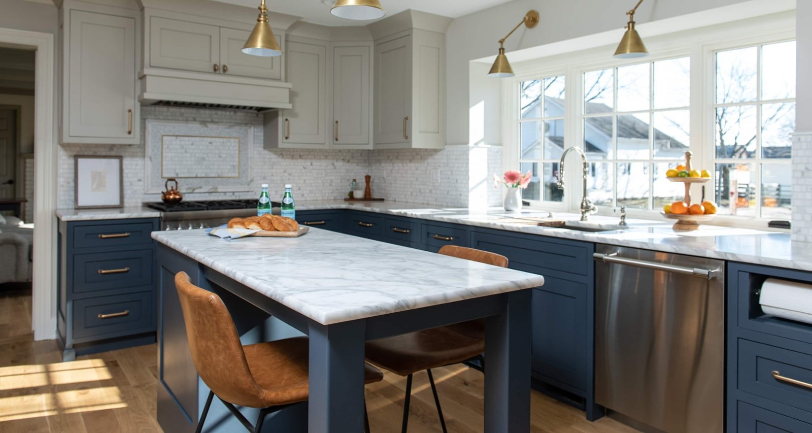
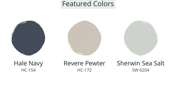
Chicago’s number one paint color is Benjamin Moore’s Hale Navy (HC-154). What makes Hale Navy so attractive is its adaptable and dynamic nature. It has both a cool and warm undertone. It’s fully saturated, yet it doesn’t have to steal the show. It’s bold, and it makes a statement, yet it is also subtle in that it’s a very grounded color. Hale Navy is modern. Hale Navy is classic. Hale Navy is a color for the ages.
Where We’ve Seen This Top Color Used
It comes as no surprise that Hale Navy works in a number of rooms and settings. It may most often be used as an accent color, whether that’s on a bathroom vanity, kitchen cabinetry, or trim for latticed windows and doors. It’s also commonly used as an accent wall highlighting a fireplace or one wall in a dining room. Hale Navy also makes a great statement as a front door color. That said, we’ve also seen it very successfully implemented as the main exterior wall color of houses with light accents like bright white trim. 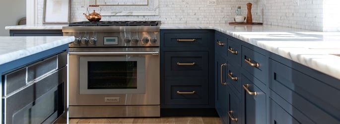
Textures and Colors that Go Well with Hale Navy
Another factor that makes Hale Navy such a success? It pairs well with almost any texture and material. It works well alongside brick, wood, stone, leather, wicker, glass, copper, and other metals. It also works well with patterns and makes a successful pairing with wallpapers (in delicate doses) that carry a similar hue. We do recommend using Hale Navy in well-lit spaces that can show off the full potential of the color in the changing light of every hour of the day.
2. Revere Pewter by Benjamin Moore
A Top Neutral Kitchen Cabinet Color
Hale Navy + Revere Pewter = a match made in heaven! It’s no coincidence that one of the colors Hale Navy pairs perfectly with another top Chicago paint color: Revere Pewter (HC-172).
While this combination is tried and true, it should also be noted that Revere Pewter can also stand alone. Like Hale Navy, Revere Pewter works well alongside a bright white. It may be classified as a light gray, but the warmth of its tone makes it akin to a beige as well.

Why Chicago Home Designers Love This Cabinet Color
The reason that this color is so popular is that it is perfectly unobtrusive, lending an aura of calm and peace. Revere Pewter is very easy on the eye, adding warmth to any space while simultaneously making spaces feel open, airy, clean, and bright.
Where We’ve Seen This Popular Color Used
This popular tone is often used as a backdrop for full walls, whether that’s in the living room, the dining room, the kitchen, a bedroom, or a bathroom. Because it is so subtle and pairs with almost any color, it is also perfect for transitional spaces like hallways and staircases. It works with brick and warm woods (both light and dark), and it can be paired with playful color “pops” like coral. We also love to see it used on the trim in a home for something a little more unique.
Other Trending Paint Colors in the Chicago Area
We couldn’t leave this blog without giving a shout-out to four other go-to colors that are very popular in Chicago’s northwest suburbs.
3. Sea Salt by Sherwin Williams
Sherwin Williams’ Sea Salt (SW 6204) is aptly named. Like its namesake, Sea Salt is a green and gray paint with cool undertones. It’s a fresh color that’s subtle yet captivates the eye, and it makes a wonderful backdrop for bright white furniture, cabinetry, and built-ins. While it has been used successfully in hallways, dining rooms, kitchens, and bedrooms, it tends to be a favorite color in bathrooms.
4. Urbane Bronze by Sherwin Williams
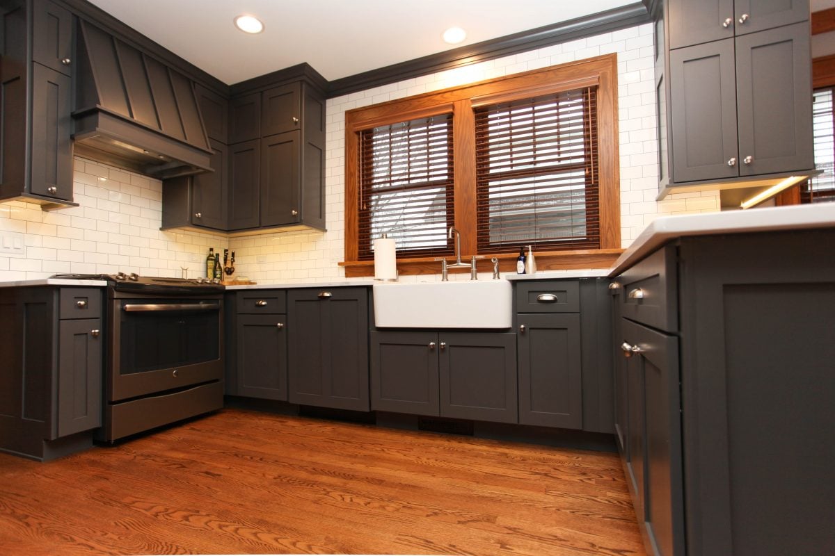
If you’ve ever seen Sherwin Williams’ Urbane Bronze (SW 7048), you’ll understand why it was named the Sherwin Williams 2021 color of the year. Urbane Bronze has gravitas. A dark and warm gray, it is both calming and comforting, “embodying the richness of the earth’s stone, metal, and wood.” This color pairs well with light woods, leathers, stone, and metal. It is often seen in living rooms with plenty of natural light, sitting rooms, and bedrooms.
5. Simply White by Benjamin Moore
Simply White (OC-117) was Benjamin Moore’s 2016 color of the year, and it is a testament to the perfection of the color that it is still a desirable color today. With its yellow undertones, Simply White is a cheery, bright, and clean color that works well on kitchen walls, cabinetry, trim, and even ceilings. It’s also a popular color for bathrooms, bedrooms, and living rooms.
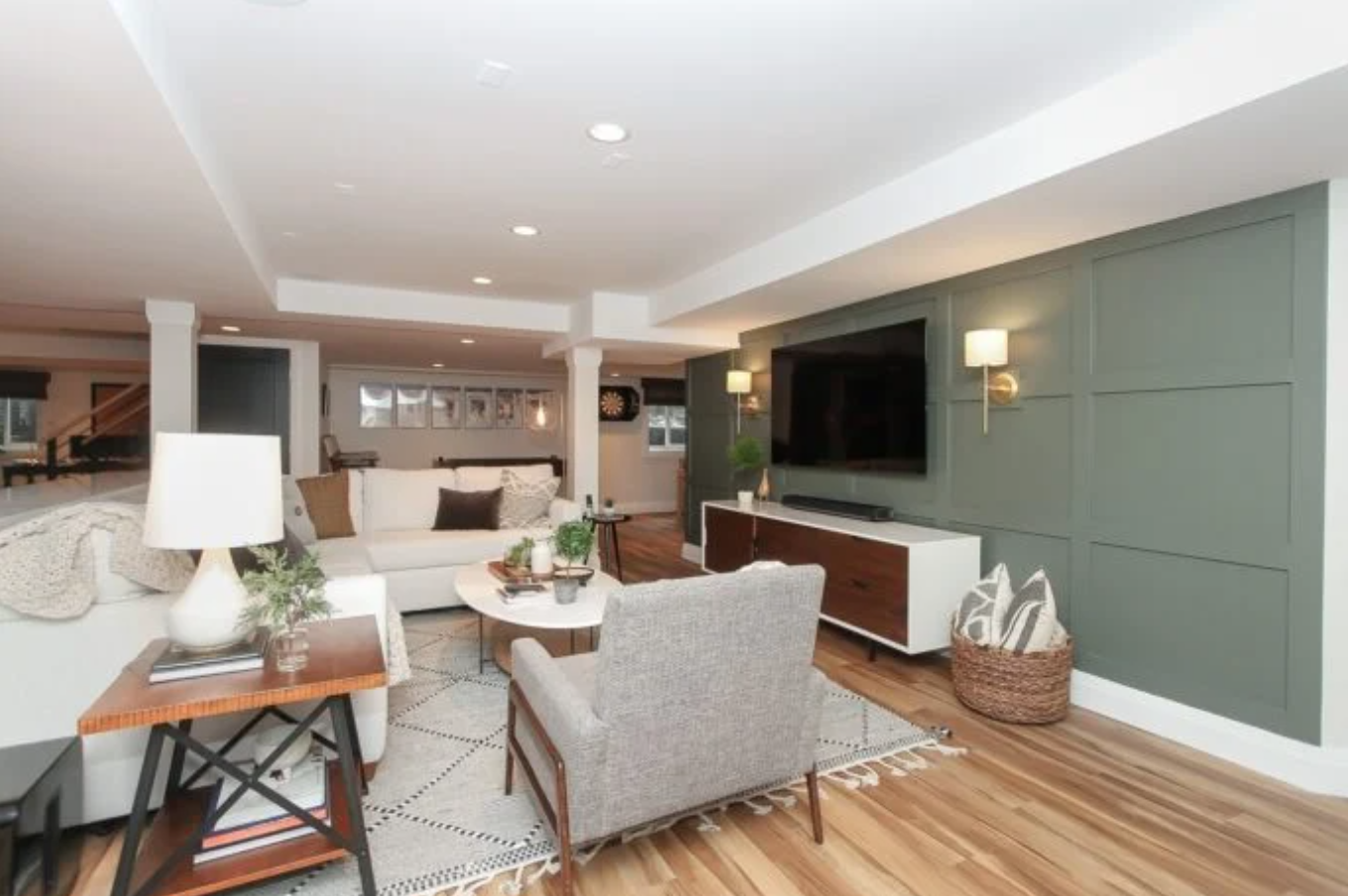
6. Pewter Green by Sherwin Williams
Sherwin Williams’ Pewter Green (SW 6208) is difficult to describe yet unmistakably recognizable once you’ve seen it. Dark, grounded, and with gray tendencies, this color is lauded and loved by homeowners across the U.S. It was selected as Sherwin Williams’ color of the month in December 2021, and it is a beloved tone for kitchen cabinetry.
Each of these six colors offers a unique mood that many homeowners love, and we’ve already seen them in several 2021 Chicago area home renovations. If you're thinking about a kitchen remodel and love one of these colors, our cabinets can be color-matched to any color above. We'd love to help you get started!
Unlock the secrets to a stunning home renovation by reading the eBook "The Ultimate Step-by-Step Home Renovation Transformation Guide."
Chicagoland Design and Build Service Areas

